
|
|
Floris BooksFloris Books, the Edinburgh-based publisher of non-fiction and children's books, commissioned this refresh of the brand identity to mark the company's 40th birthday.
They wanted a clean, sophisticated logomark that remained true to the values that Floris is well-known and respected for. The resulting logo consists of a bird (an image maintained from the previous mark) and clean, mature serif type. florisbooks.co.uk |
|
|
KelpiesFloris Books found that their children's imprint, Kelpies, had rapidly
grown in size and scope, rendering the single logo ineffective in communicating the direction it was moving in. The result was a collection of eye-catching, distinctive and lighthearted logomarks that connect the new imprints while being effective in their own right. discoverkelpies.co.uk |
|
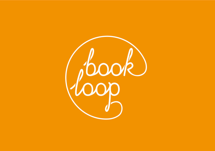
Book LoopBook Loop is a Scottish start-up that hosts events that aim to enliven, inspire and support the Scottish book publishing industry and all who work in it.
The logomark needed to convey the vital and social nature of the company whilst playing on the idea of networks and connections that the industry finds so crucial. |
|
|
2020:
|
|
|
Harehurst JewelleryHandcrafted in the heart of Hampshire, Harehurst Jewellery is personalised, allowing the wearer to tell their story.
The logomark needed to convey the personal, contemporary nature of the company and the quality of the products both online and in print. |